Our Story
Morea takes its name and its wave from still, coastal water — and asks what that same sense of calm might look like in a soap bar you reach for ten times a day.
Where It Started
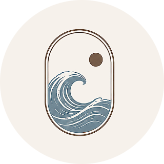
Morea's mark is inspired by a wave held inside a rounded arch, quiet and self-contained, with a single sunset above it. It's the shape of a horizon seen from close to the water — calm, but never still.
Everything that followed — the name, the palette, the product itself — was built to earn that mark, not just wear it. Cyprus Blue and Dark Cedar came from the same place: one the color of deep, settled water, the other the color of the shoreline it meets.
What We're Building Toward
The most basic promise of a soap, kept properly: a real lather and a clean rinse. Cleanse isn't the interesting word on the label, but it's the one that has to be true before anything else matters.
Hands that get washed ten or twenty times a day earn the right to a formula that doesn't fight back — no tightness after the fifth wash, no film that needs a lotion to undo. Nourish is the difference between clean and comfortable.
Not luxury for its own sake — just enough intention in the shape, the color, and the box that the bar earns its spot on the counter. Elevate is a design decision as much as a feeling.
On the Details
A few of the decisions that went into the bar before a single unit was produced.
Most soap is scented to sell itself. Ours is left unscented so the perfume you chose speaks for itself.
Every bar carries the Morea mark and wordmark engraved into its face — the brand is in the soap, not just on the box.
The bar's shape and colour are based on a physical sample from our maker, not a render on a screen.
“We didn't want a soap that hides in a drawer. We wanted one worth leaving out.”Morea Essential